For the past 23 years, Pantone has been proudly bringing light to the power of color. The Pantone Color of the Year is chosen based on the direction and trends of people in all markets across the globe. What color will resonate with all audiences in 2022?
Defining a Year of Uncertainty
As we approach the two year mark of the coronavirus, people are craving stability, security, and calm. At the same time, there is an overwhelming hope for growth in the post-pandemic world. Individually, many are hoping to improve their quality of life by pursuing passions, seizing opportunities, and reevaluating priorities. On a larger scale, many hope to bring changes to social and economic standards. Can a color encapsulate stability and change?
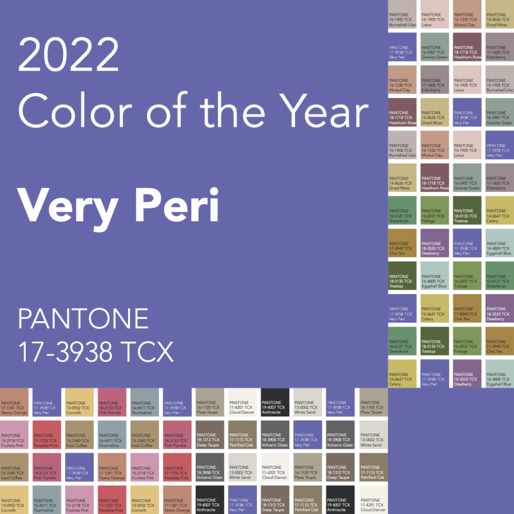
Introducing PANTONE 17-3938
Very Peri is Pantone’s answer, and she is simply stunning. This is a new release for Pantone, marking the first time in the history of the Pantone Color of the Year that a new color was developed for the release.
Like all periwinkles, Very Peri is ultimately a blue hue. Blue is a universally classic color, carrying an air of predictability. Blue is the color of the sea and the sky – there is nothing more stable in our world. At the same time, hints of red and magenta warm the periwinkle to a point just shy of purple. They give this shade an undertone of excitement and boldness. Straddling the line of warm and cool, this is a color of dynamic possibilities.
Trending Color Palettes
Balancing Act
This color palette features poised and well-composed hues across the spectrum. Their complementary partners support each other, rather than compete for attention.
Wellspring
This analogous theme brings a feeling of harmony and peace. The colors blend effortlessly and are soothing on the eyes.

Star of the Show
This selection of neutrals are perfect backdrops to allow Very Peri to pop as a welcome splash of color. The warmth in these creams, grays, and browns bring out the best in Very Peri.

Amusements
A joyful triad will liven up any application. This set holds a sense of sophistication without taking itself too seriously.

Reference Color Data
PANTONE
17-3938 TCX
sRGB
102 103 171
HEX
#6667AB
LAB
45.75, 12.21, -36.75