Did you hear? Pantone’s 2020 color of the year is Classic Blue (#0f4c81)! This year’s color of choice has been defined as a stable, timeless, comforting hue to pave the way for our journey into the new 2020 decade. Here are some practical suggestions for implementing this year’s color trend in your designs.
Classic Blue: What Works
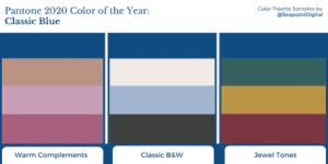
- Warm Complements
Classic Blue sits near the center of the warm and cool spectrum, but leans ever-so-slightly toward a warmer tint. Supporting Classic Blue with additional warm tones is like providing it with a harmonious choir of hues, and allows it to really sing. You won’t do much wrong by pairing cool tones with Classic Blue. However, I recommend using warm tones instead; due to its slightly warm nature, warmer tones will especially enhance Classic Blue’s value.
- Classic B&W
Off-whites and neutrals are a safe and conservative style trend… just like 2020’s Classic Blue. If you want a modern look for your design but aren’t sure how, try adding subtle undertones to a neutral palette and using Classic Blue as your statement color.
Slight yellow tones are especially recommended because they’re opposite to blue on the color wheel; just a hint of yellow can really elevate Classic Blue … perhaps even more than the always-safe plain white!
- Jewel Tones
Both of the previous suggestions lean more on the safe side of color theory– but what if you want to really make a statement?
Using jewel tones can make Classic Blue’s traditional appeal stand center stage while making an expressive statement. Depending on the other colors involved, Classic Blue can either command attention, take a backseat, or help enhance the other rich tones.
Another option that may push the envelope is to pair Classic Blue with at least one neon. This may draw the attention away from this year’s trendy tone, but can still be an effective use of the color.

How to Use Classic Blue in Your Graphic Design
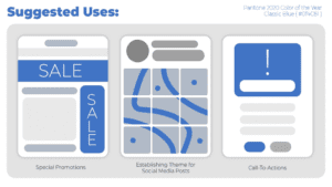
- Promotions
Due to its significance as 2020’s Color of the Year, one great idea is to incorporate Classic Blue as a theme color in your business promotions (like Google Ads) all throughout the year!
- Social Media
Try to incorporate the color into your social media posts. That way, consumers can subconsciously identify an active promotion from an expired or out-of-season one.
- Call-To-Actions (CTAs)
Classic Blue is a wonderful statement color. You can embrace its regal authority by incorporating it into graphic elements that typically demand attention, such as headers, banners, pop-ups, bold statement text, or CTA buttons.
Greet the New Decade With Classic Blue
In summary, Classic Blue is a warm statement color that, when used correctly, brings a sense of fun and freshness to your designs. The safest way to play responsibly with Classic Blue is by pairing it with black & white neutrals and warm undertones. Staying in its own color family is also a safe option to create a harmonious design. And, if you want a more vibrant look, try pairing Classic Blue with a harmonious jewel-tone palette.
Embrace the trend and have fun with your graphic design this year using Classic Blue!
Have more questions about digital marketing? We’d love to talk with you. Fill out the form and a member of the team will be in touch.