
The long-awaited announcement of Pantone’s 2023 color of the year has arrived, and it does not disappoint: Viva Magenta (18-1750).
A powerful and bold red, Viva Magenta straddles the line between warm and cool. It was a color chosen with intention and hope for the coming year, with the goal of inspiring courage, individuality, and experimentation. It was described by executive director of the Pantone Color Institute, Leatrice Eiseman, as “assertive but not aggressive, a fist in a velvet glove.”
Viva Magenta also serves as a bridge between the natural and digital worlds, both recalling its tangible ties to one of the ancient world’s most valuable and vibrant dyes, cochineal, while also exuding the electric excitement and promise of technology and the future. With all of this meaning and expectation behind the release of this year’s Pantone color of the year, what does Viva Magenta evoke for you?
Although Viva Magenta’s brave and fearless energy demands the spotlight, it works beautifully in connection with a wide range of colors, and its variety of alter-egos can be drawn out depending on what it’s surrounded by. Here are some combinations we’re currently enjoying:
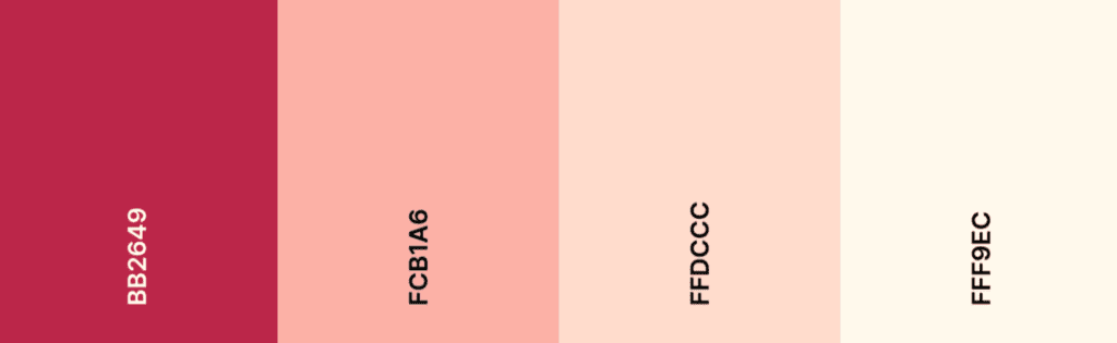
Pairing Viva Magenta with warm pinks softens it and brings out its femininity.
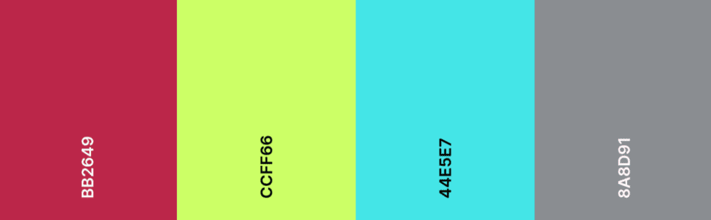
Viva Magenta plays well with neon, further electrifying the already energetic color. The addition of spanish gray completes the air of modernity and athleticism.
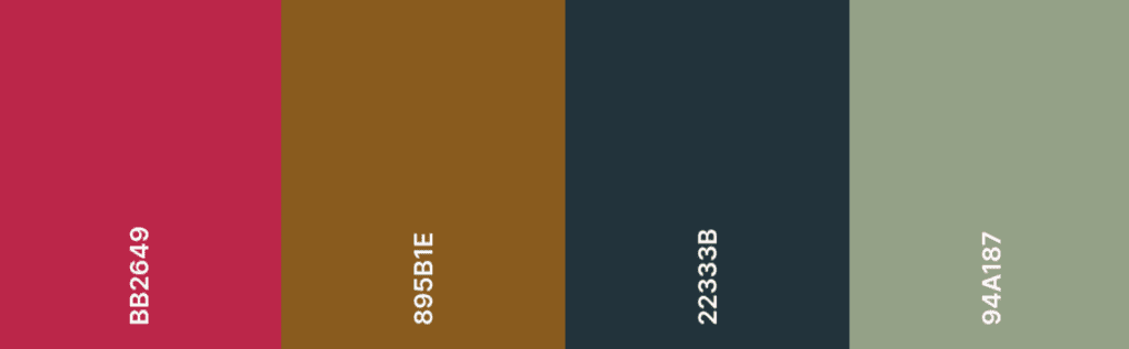
Dark neutrals ground Viva Magenta, transforming it into a mature and reliable color. In turn, it adds a refreshing air of unconventionality and joy to an otherwise serious palette.
Integrating Viva Magenta into your graphic design is a great way to signal that your marketing materials are fresh and up to date, and to differentiate them from campaigns of past years. Additionally, Pantone’s color of 2023 is ideal for marketing, as it is a confident yet friendly color that draws in and inspires the viewer. Here are some ideas on how to utilize it:
Promotions
Using Pantone’s color of the year in your promotions and ads is a good choice if you want them to stand out and make an impact.

Social Media
Social media is a great place to play with color, with its ephemeral nature lending itself well to experimentation and variety. Try using Viva Magenta to add interest to text-based images!
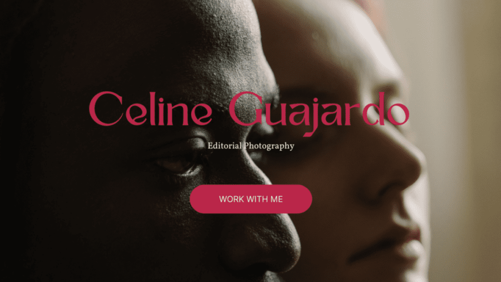
Calls-to-action
The purpose of a CTA is to draw attention and inspire action on the part of the viewer. Viva Magenta is an ideal color to use in this case, as it is by its nature energetic and dynamic.
Can a color make us brave? Can it inspire us to reinvent ourselves, encourage self-expression, even create a better future? Whatever you believe a color is capable of, you can be sure that Viva Magenta can breathe new life into your graphic design projects in 2023.