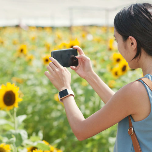
If you’ve been on the internet lately (and here you are), you know that beautiful photos and graphics rule the day. But you’re a busy businessperson, and you don’t have professional equipment or expertise. Are you sunk? Not at all. We’re here to reassure you that even if all you have is a phone camera and a little patience, your pics can look sharp. Today we’re going to share some helpful tips from a graphic designer just for you.
Before we begin, let’s briefly consider the professional opinion of Social Media professor Dr. William J. Ward, of Syracuse University:
“Blogs were one of the earliest forms of social networking where people were writing 1,000 words. When we moved to status updates on Facebook, our posts became shorter. Then micro-blogs like Twitter came along and shortened our updates to 140 characters. Now we are even skipping words altogether and moving towards more visual communication with social-sharing sites like Pinterest.”
So think about it this way: images on social media are more than just a ‘quick snapshot’. And they’re definitely not filler. They can say a lot about your brand, and communicate a message more effectively than pages and pages of text. Since social media photos can be such a valuable part of your marketing strategy, let’s get going on how to make them truly great.

When you’ve chosen your subject and are about to take your photo, make sure your camera app is either in HDR or RAW mode. Tap the screen on your subject to make sure the focus is sharp. Blurry photos represent your company poorly.
If you have a grid-guide mode enabled (typically found within your device settings), make sure your subject aligns with one or more of the intersections on the grid– not in the center. And if you don’t have grid mode, follow the “rule of thirds”: imagine the photo is divided into three even sections, and make sure the subject of your photo intersects with one of those sections.
Double-check that your lighting is favorable – you can adjust exposure directly by holding down over your subject and dragging up or down.
Once you’ve snapped your photo, ask yourself two things:
(1) If you looked at this photo for the first time, would you immediately recognize what the subject of your photo is?
(2) Does the image offer entertainment, value, or a story to the viewer?
But what if you’re posting a graphic rather than a photograph? Make sure you keep the canvas resolution nice and high. I personally like to aim for 1080×1080 pixels and 300 DPI, otherwise, sites like Twitter and Instagram will try to aggressively compress it.
Here’s a list of my personal favorite photo editing options for mobile devices:
SNOW
(For iOS & Android) Has really cool features that allow you to augment your facial shape, makeup, add stickers, animations, cool borders, and really fresh filters! This is honestly my one-stop trip before I go to post any selfies (because maybe I want to blur my pores a little, okay?).
Adobe Lightroom
(For iOS & Android) You need to have an Adobe subscription (starting at about $10/month) in order to access this app, but for photography lovers who care about the finer details like RAW images and nuances of exposure, this is industry-standard software in the palm of your hands.

Instagram
(For iOS & Android) Right after you select which photos you’d like to upload to Instagram, you get the opportunity to edit photos! You can either apply a filter to all images, or tap on pictures individually to fine-tune them. Personally, I recommend the latter, as each photo is individually unique and requires proper adjustments. If you do decide to go with a default photo filter, try to keep the percentage of your filter below 50% or less. Subtlety is good.
In-app camera settings
Don’t feel like downloading any photo editing apps? That’s fine! Most modern smartphones allow you to make photo adjustments from within the Photos or Camera app on your phone. A minimum freshening up is better than nothing!
Go-to adjustments tend to be a lightening of shadows and sharpening. Just be careful not to make your picture look TOO edited, as that can be a bit of a turn-away.
Perhaps you want to go the extra mile and make a composite of your photos. Good for you! I honestly only have one proper recommendation for you, and that is the Canva app. The program is streamlined with many attractive presets that’ll make your photo compositions look super sharp in a snap.
Say hello to our intern, Jared! 🙂

A mindless snapshot. Jared is center-focused and the subject is clear, but so are a lot of the surrounding environmental details. Are we meant to be seeing more of the photo hanging in the background? You shouldn’t have to be guessing.

This time we implement the Rule of Thirds idea. Jared overlaps the imaginary 1/3 mark, and now the story this photo is telling has already become clearer. We can see that he’s working with his laptop and coffee!

Here we have a few subtle tweaks made with the Adobe Lightroom app. The image details are slightly crisper, and the blue shadows in Jared’s shirt stand out a little more to help him pop against the orange wall in the background!
We have several blog posts dedicated to relevant subjects like how hashtags work on different social media platforms , 4 tips for Instagram success , and even ideas on what your business should post . Feel free to check them out!

